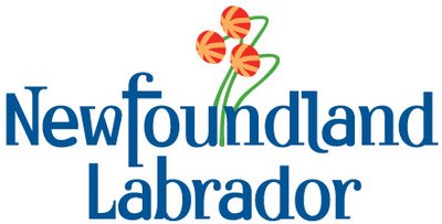
Anyway, the province has a new brand, which looks like this:

So upon seeing the province's new brand, I asked what does this say to me? Perhaps even what kind of slogan that might go with this brand. I mean, "Yours to discover" was out there for years. I assume a new "brand" means there is a new slogan.
How about this one: "NewfoundlandLabrador - dragging down national education test scores by flunking remedial grammar since 1949."
No? A bit wordy, perhaps? Mmmmm, you understand my point, though. I mean, how hard is it to stick "and" in there? Or hell, even "&". NewfoundlandLabrador just isn't doing it for me.
But that's just the name. What about the....things coming out from Newfoundland. So how about this for a slogan: "NewfoundlandLabrador - come for the wine, women and song, leave with a parasitic disease."
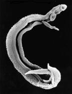
Seriously, though. Don't those things coming out from Newfoundland look a bit like this:

Which, by the way, happens to be a fluke. First thing I could find on Google that looked vaguely like what's in the brand.
Then again, let's be honest. It's not a parasite. And if we're going to do a slogan to match the brand and the reality of the province, it likely has to be this:
"NewfoundlandLabrador - "Come and visit the coolest place in Canada. Stay because our slug-like alien overlords demand it."

Tell me you don't see some similarity between the two...besides, haven't we all thought at some point that aliens were running the province. It would explain so much when you think about it.
On the bright side, I do kind of like the font and the colour (and unsurprising blue to match the Tories, much like the previous colour was red, to match the then-governing Liberals). And it's certainly better than what MUN produced last summer. All the province managed to forget was the "and". The university managed to forget where it was located.
But my problem with the brand is this. I know it's supposed to be a pitcher plant. Most people in the province will probably clue into the fact that it's a pitcher plant. But people outside the province, who wouldn't know a pitcher plant from a baseball pitcher. I was kidding, but only sort of, when I mentioned parasites and alien slugs above. A lot of people really aren't going to have a clue what those things are suppose to be.
Kind of stupid, really. I wonder how much money the government spent on something that is probably going to have to be explained every time it is used?
11 comments:
Don't pitcher plants have pitchers?
It's more like three bakeapples on tall stems without leaves.
Or triffids.
Or peyote caps.
"Newfoundor"; become the new entrance!
Catchie, inn'it, by?
Definitely--they're triffids. I disagree with you about the font. It looks unprofessional. In fact it looks eerily similar to that used for the Gilligan's Island titles. (Which perhaps is someone's idea of a subtle joke.)
Perhaps a more apropro font could have been the one used for The Prisoner.
I think it looks kind of like eyeballs with the optic nerves still attached.
And it's now my effing letterhead.
Cat, it's not that I don't think the idea of coming up with an alternative logo is a good idea, it's just that rjproduct.ca is already doing something on it. So I encourage people to go forth and create their own design and post it on his site. I have no sense of design, so I'll be passing, but I am curious to see what people will come up with.
And Pat, yes, there are now special government eyeballs on your stationary. They can now watch everything you're doing. But don't feel paranoid or anything....
I'm not sure I understand where the cobbled together idea comes from. Font theory is an interesting beast and a particular font appeals to certain people more than others. I actually like the font (apart from the "a" which I think doesn't quite fit right as it isn't proportional to the rest of the letters).
I think the flowers are just plain weird and looked way better small than large.
I _like_ the concept of the logo, I _like_ the blue (never mind the conservative aspect of it), I like the placement of the flowers, I don't even mind replacing & with a "-" (not that they did that either).
I'd like to hear from the target audience for this logo/font. Remember, it really isn't us. Designs should be created for the intended audience which in this case is people from out of the province. The font is specifically a blocky, medieval type font, or at least one that is recognizable as such. I guess they are trying to appeal to getting people associated with the Vikings.
I'd love to hear what a Labradorian thinks about this logo. Does this fit the non-island portion?
Again, don't completely dismiss it, I think they have some good elements in it. As his nibs says I'd love to see the full design/marketing doc that resulted in this logo.
Cheers
Dups
HA! This post made me laugh out loud, Craig.
Yeah, as soon as I witnessed the unveiling of the logo at the launch, I immediately thought of triffids and cringed.
There is something of the Irish uncial hand about the font, Dups, (think Book of Kells) but I doubt very much if people would make the Irish connection. They'd have to have seen MSS from the period.
Even your typical Viking tourists are more interested in "oh wow, some bearded guys in boats with horns on their heads sailed all the way over here about (two to nine) hundred years ago. Isn't that cool?" It's not like most have seen any sort of writing from the period. The Icelandic sagas (written down two hundred years after the fact) are written in a different hand/font than the Irish uncial but if I'm remembering correctly still have rounded letter forms. "Viking" MSS from the era 900-1100 are few and far between. I can't think of one offhand, actually.
I think you're right--some sense of medievalism inspired the font. But it isn't going to send any sort of message to the majority of the public, largely because most of the public are ignorant of the originals and thus wouldn't make the connection.
Dear God, could that have been even more geek?
There is something of the Irish uncial hand about the font, Dups, (think Book of Kells) but I doubt very much if people would make the Irish connection. They'd have to have seen MSS from the period.
Several media pundits have made the celtic connection. It was probably discussed at the launch itself.
We're SO Irish, you know.
Irish Irish Irish.
Despise it. Hate it. Deplore it.
But I CHALLENGE you. Come up with something better as I have:
http://venisontickle.blogpot.com
And if you were thinking the same thing, I will take your word for it and just say "Full Marks!"
Cheers,
Ward
Colette, you could have been more geeky if you had actually responded while wearing the Eowyn costume I strongly suspect you have stashed away in a closet somewhere.
And WJM, we are all Irish. In fact, Dups is part of the little known "Mocha Irish", not to be confused with the Black Irish. To blend in, Dups has actually dropped the "O" in front of his name. It used to be O'Wijiawardhana, but the proddys used to give him grief about it.
Post a Comment